Branding:
Titi Tea
년도
작업 도구
지도 교수
Year
Medium
Instructor
2026
Adobe suite, generative AI
Aggie Toppins
Context
Titi Tea는 ‘공주’라는 개념을 차라는 매개체를 통해 소비자와 연결하는 중국식 티 브랜드입니다. 차를 마시는 행위를 통해 누구나 공주의 삶을 상상하고 자신만의 방식으로 이 과정을 즐길 수 있도록 만들고자 했습니다. 고객에게 자신의 일상을 보다 아름답고 의미 있는 순간으로 인식하도록 돕는 것을 목표로 합니다.
Titi tea reimagines traditional royalty and elegance for contemporary audiences. The ritual of drinking tea becomes a medium that bridges the consumer with the concept of "princess". The brand lets anyone imagine their life as a princess and make their daily life more meaningful.
Strategy
브랜드의 핵심 개념인 '공주'를 보다 직접적으로 전달하기 위해 마스코트를 중심으로 프로젝트를 진행하였습니다. 워드마크의 핵심 요소인 하트 모양을 기반으로 제작된 두 마스코트는 늘 절제되고 우아한 태도를 유지하며, 브랜드의 정체성을 시각적으로 구현합니다. 이들은 단순한 캐릭터를 넘어, 소비자가 지향하는 이상적인 이미지를 상징합니다. 모든 3D 이미지는 Nano Banana를 통해 제작되었습니다.
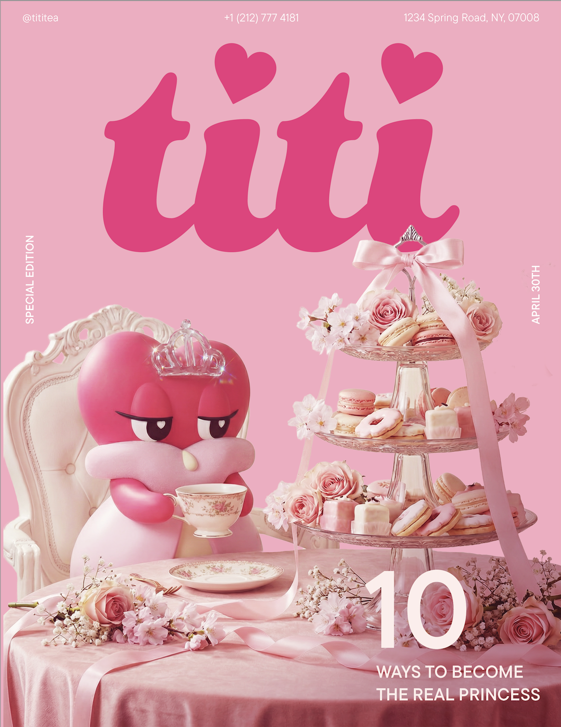
I created two mascots for the brand to reduce the proximity between the concept of princess and the audience. These mascots always perform elegant and refined behaviors, visualizing the identity of the brand. Their roles transcend that of an appealing character, but symbolize consumer's ideal self. All 3D images were created through Nano Banana Pro.
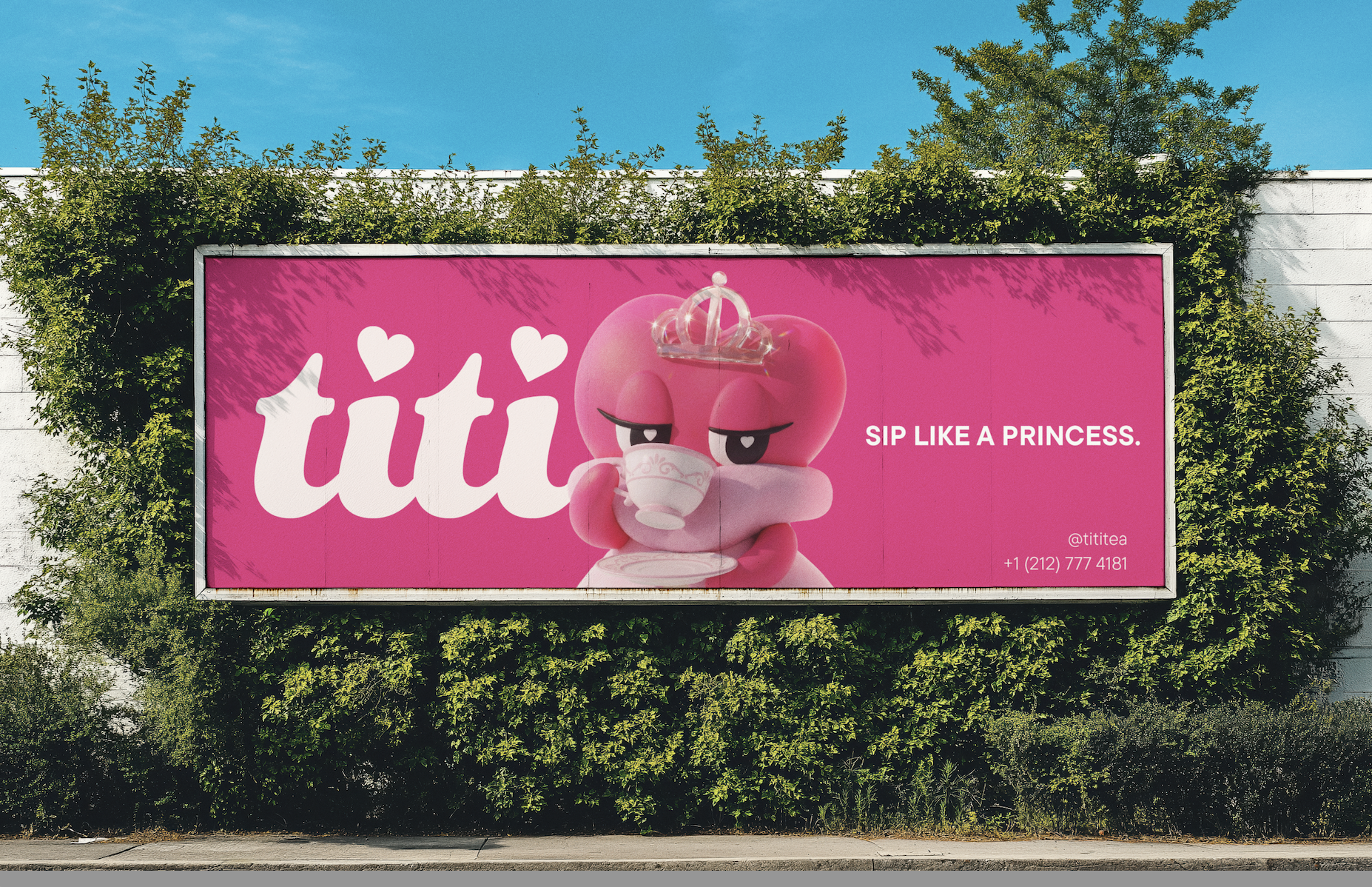
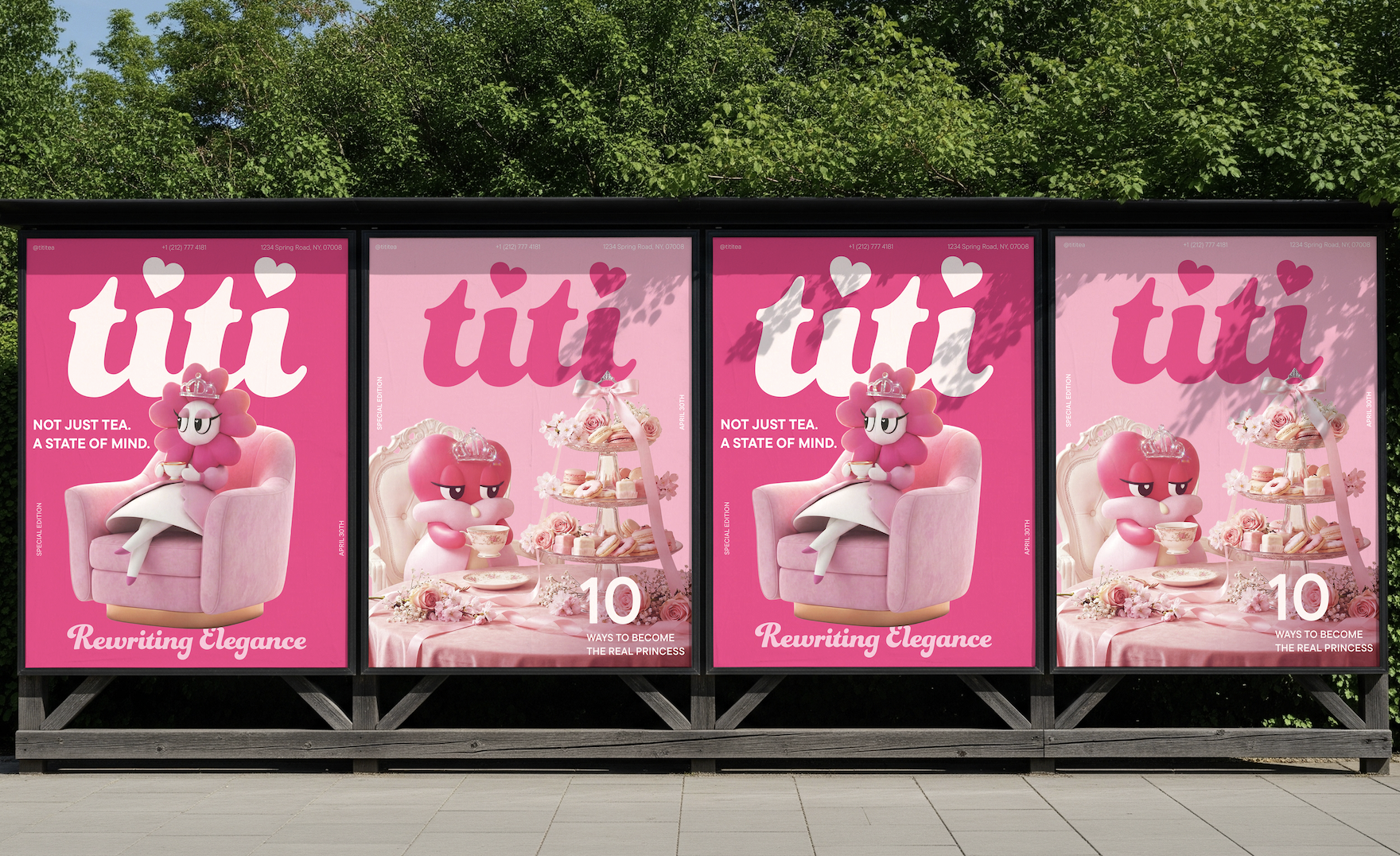
빌보드 광고 디자인
Billboard advertisement design
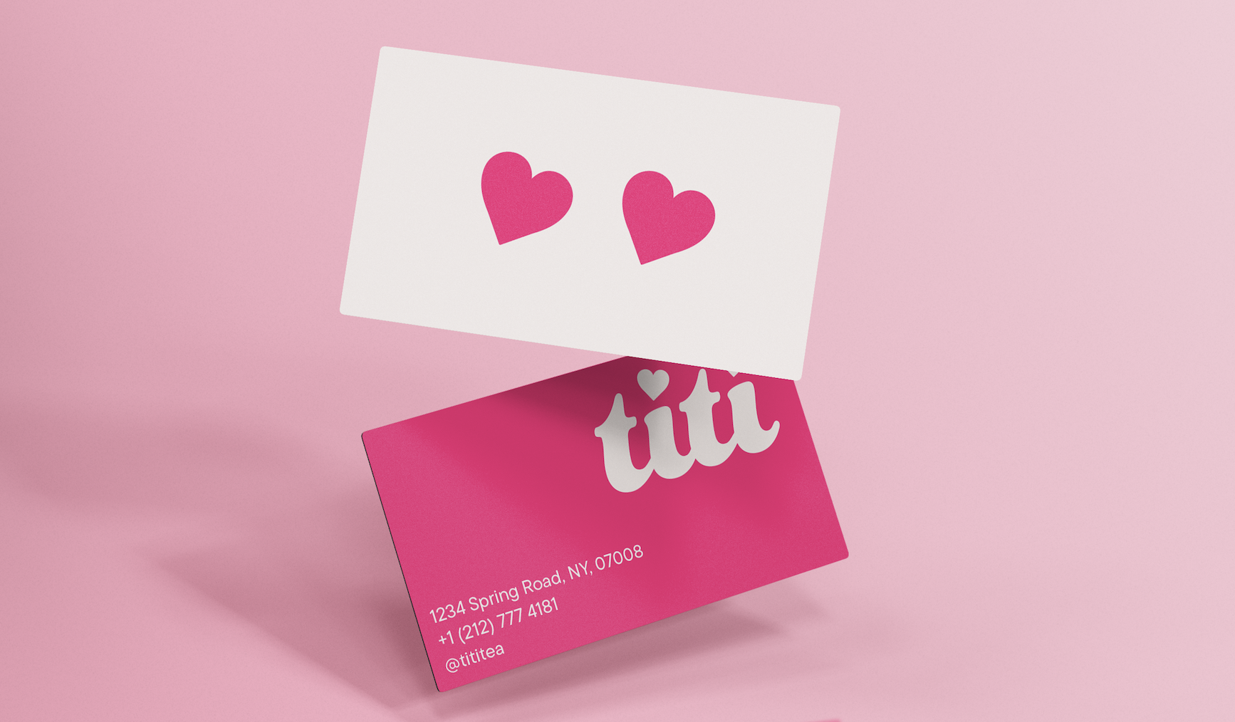
명함 디자인
Business card design
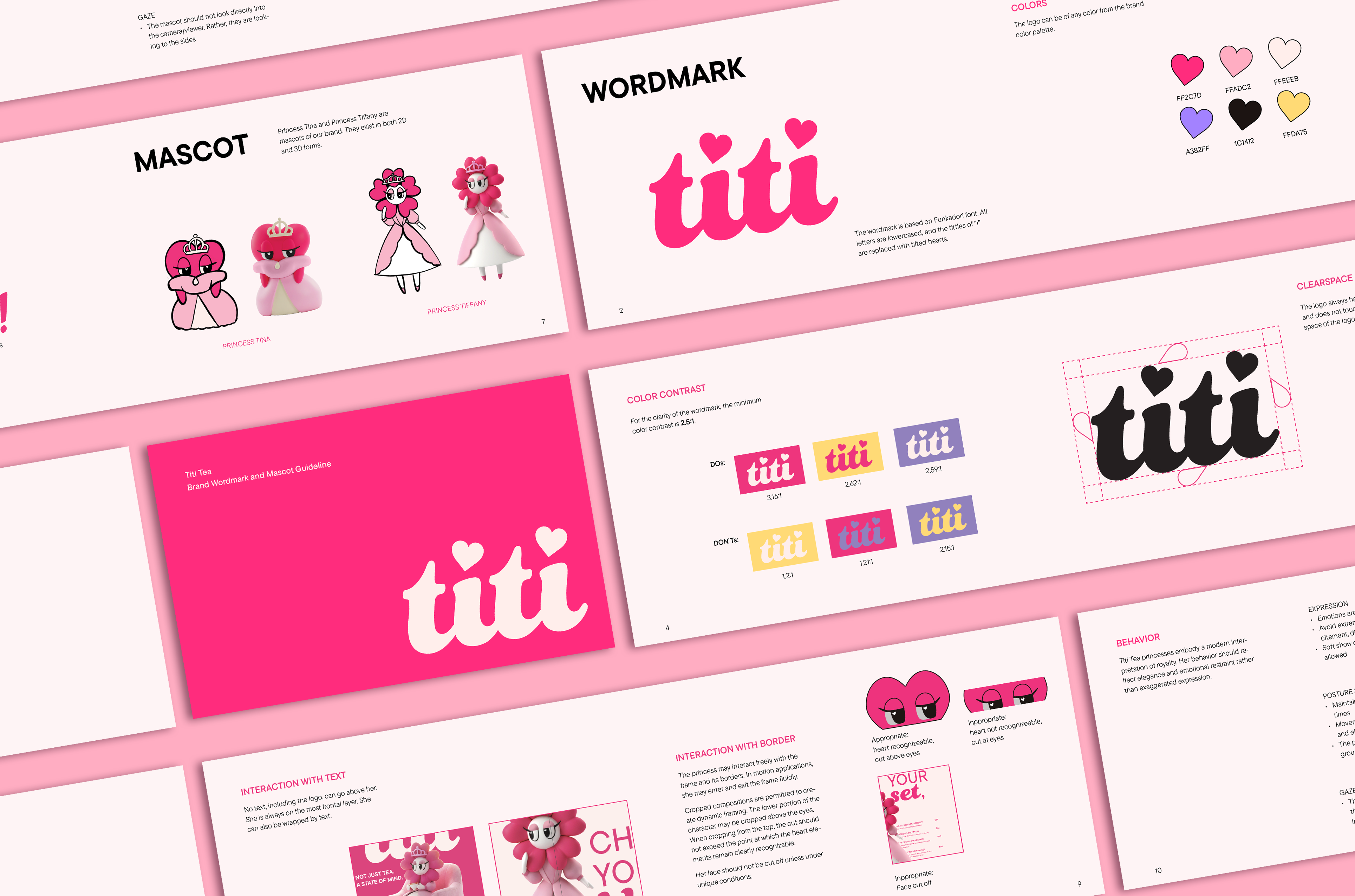
브랜드 가이드라인
Brand guideline
Print Design
광고물들은 패션 매거진과 화보에서 영감을 받아 제작되었습니다. 트렌디하면서도 하이엔드한 무드를 통해 "공주" 테마가 지닌 우아함을 동시에 강조하고자 했습니다. 특히 메뉴판의 내지에 잡지 레이아웃을 차용하며 소비자에게 색다른 경험을 선사하였습니다.
Promotional materials were inspired by Fasion magazines and photoshoots. The trendy but high-end atmosphere this motif creates capture the elegant but stylish nature of the brand.
포스터 디자인
Poster design
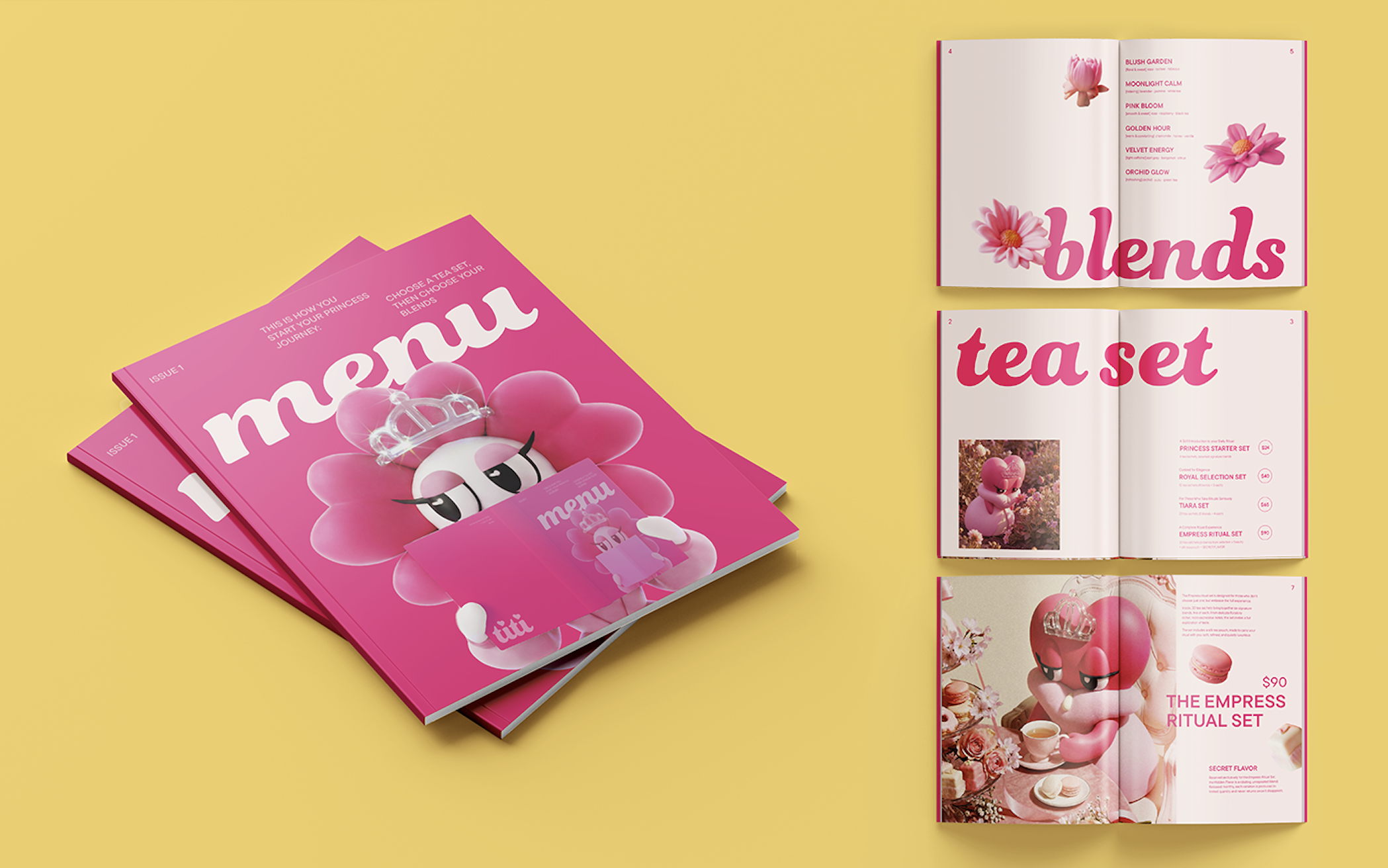
메뉴판 디자인
Menu design
Package
마스코트의 아웃라인과 두 눈을 활용한 패키지 디자인을 제작했습니다. 제한된 색상의 사용을 통해 통일감을 주었습니다. 집 모양의 패키지는 "인형의 집"에 영감을 받아 만들었고, 해당 완구가 지닌 귀여움과 여성스러움을 적용시키고자 했습니다.
I used the heart outline and eyes of the mascots to craft the package design. Through the limited color palette, I have established cohesiveness across the designs. For the larger package, I was inspired by a doll's house and made use of the femininity and cuteness the toy inherits.
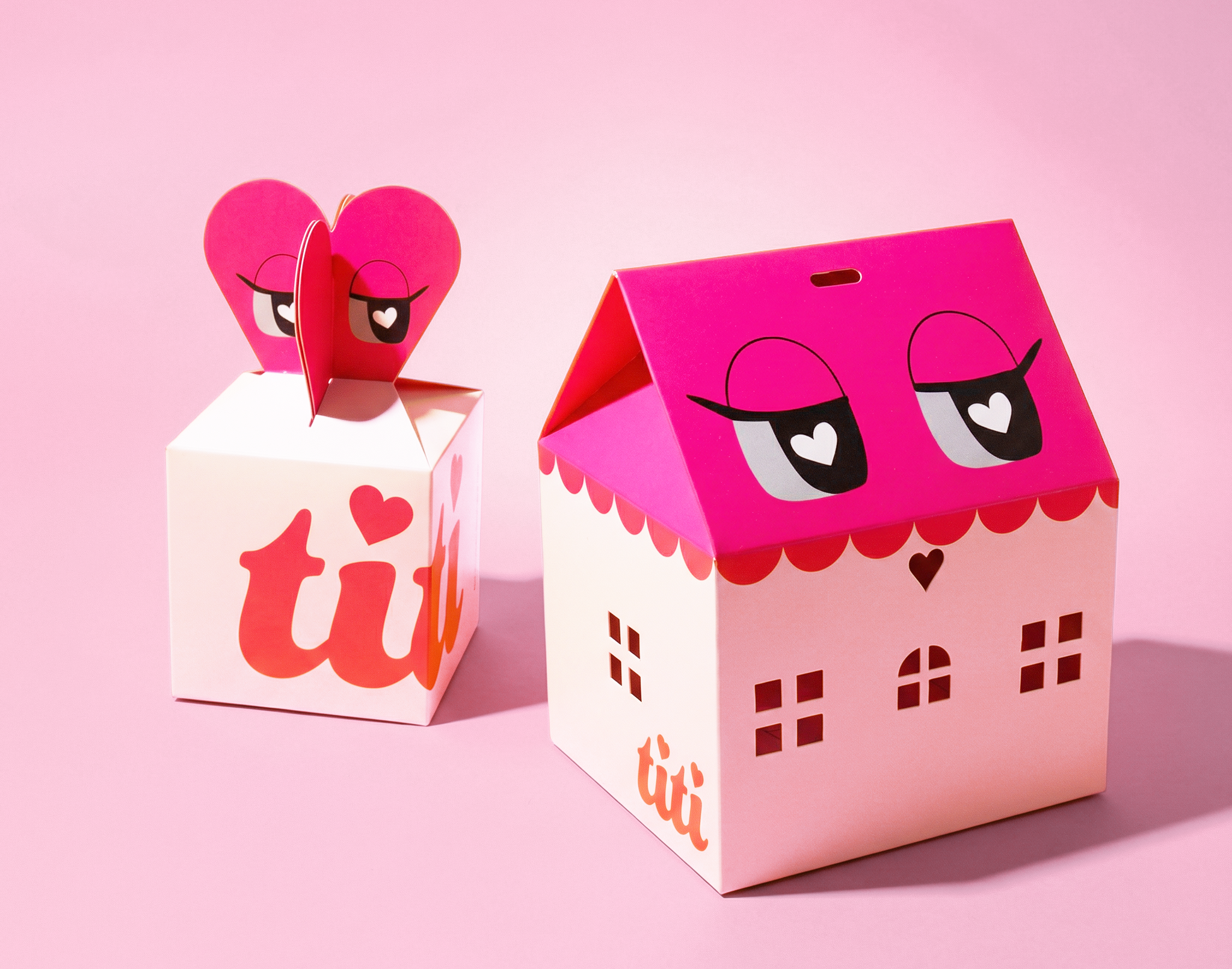
패키지 디자인
package deisgn
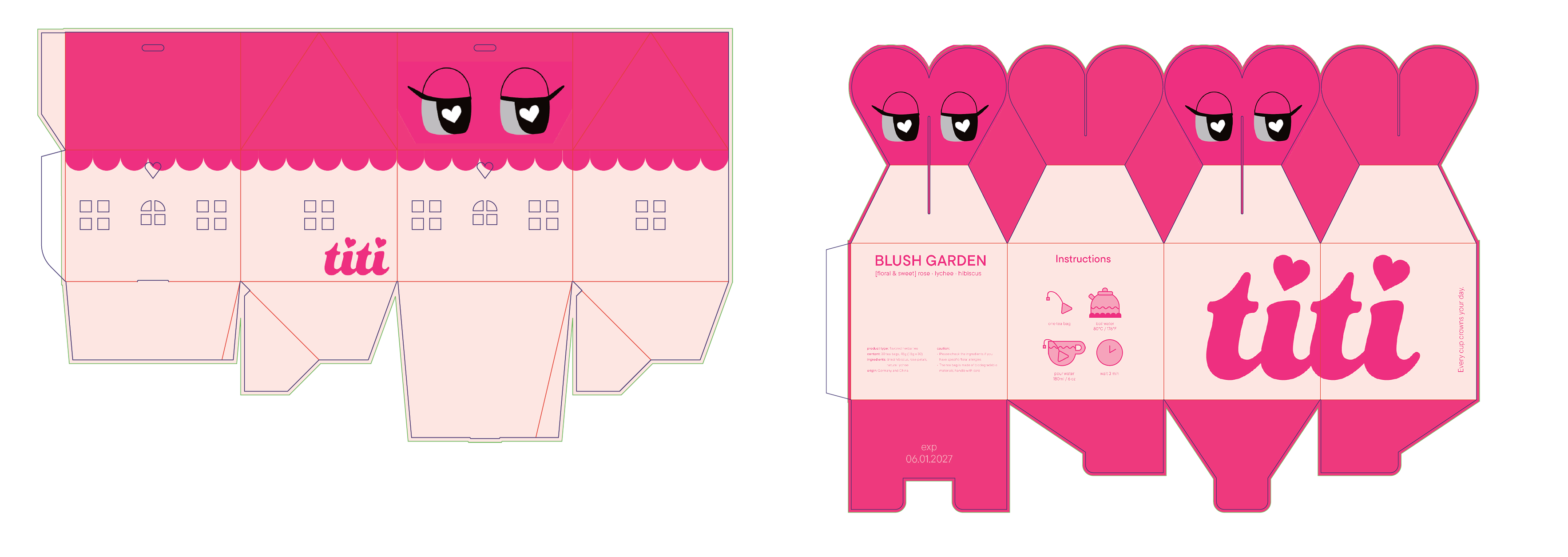
패키지 전개도
dieline design
Process
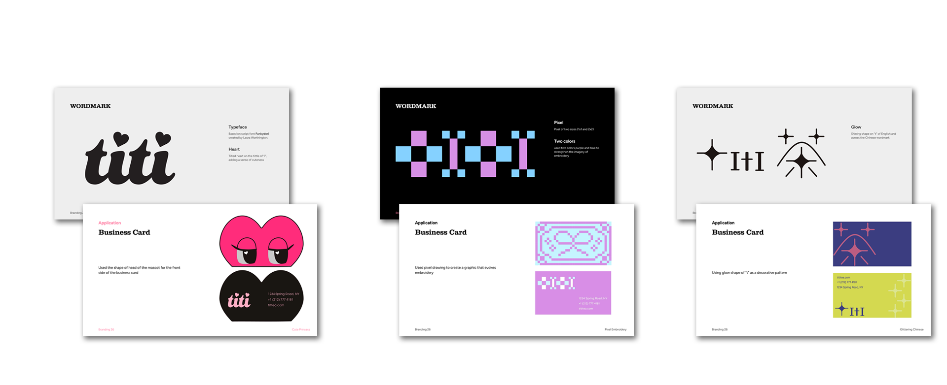
‘공주 차 브랜드’라는 키워드를 바탕으로 세 가지 방향성을 탐구하였습니다. 첫 번째 방향은 브랜드의 키치한 감성과 공주라는 정체성을 직관적으로 드러내는 데 초점을 맞추었고, 두 번째 방향은 픽셀 형태의 정사각형 반복을 통해 구조적인 방식으로 여성스러움을 표현하고자 했습니다. 세 번째 방향은 브랜드의 중국적 요소를 강조하여 차 문화의 기원을 시각적으로 드러내는 접근이었습니다. 이후 주요 타깃 소비자인 15–25세 미국 여성층을 기준으로 피드백을 반영한 결과, 브랜드의 개성과 매력을 가장 효과적으로 전달할 수 있는 첫 번째 방향으로 최종 결정하였습니다.
I initially explored three different directions for the brand. The first, which became the final direction, used mascots to emphasize the theme of princess and bring a cute atmosphere. The second direction used repetitive square forms to evoke embroideries and magnify the historical femininity of the ritual. The third put more focus on the Chinese aspect of the brand but also added a sense of trendiness through the sparkle form of 't'. I surveyed 15-25 year old females, who were identified as the main audience for the brand, to choose the final direction.