Creative Coding:
Screen Use Symposium
년도
작업 도구
지도 교수
Year
Medium
Instructor
2026
p5.js, Indesign
Luiz Ludwig
Context
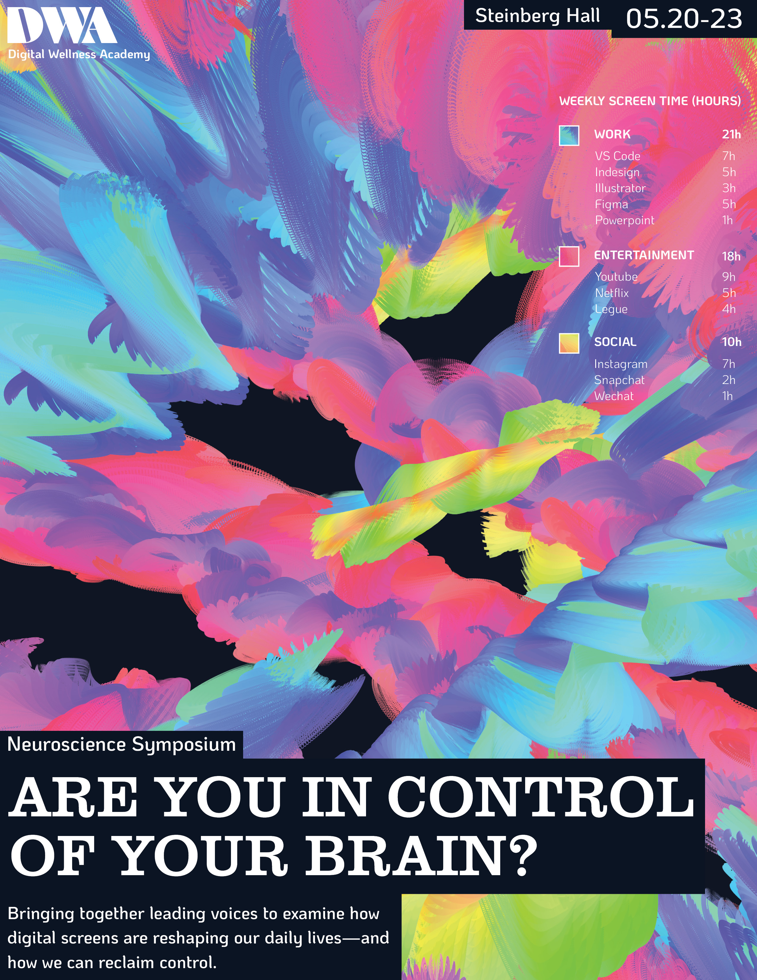
현 디지털 시대에서는 ‘스크린 타임 기록’이 개인의 성향과 특성에 대한 포괄적인 정보를 제공합니다. 이에 따라 전자기기 사용을 주제로 한 과학 심포지엄 “Are you in control of your brain?” 의 홍보물을 위해 개인의 스크린 타임 데이터에 반응하여 변화하는 키네틱 타이포그래피를 디자인하였습니다.
In the contemporary digital age, an individual's screen time record reveals far more about their personality and behavioral patterns than one might expect. For the promotional materials of a neuroscience symposium centered on screen time “Are You in Control of Your Brain?” I designed a kinetic typography piece that adapts to one's screen time data.
Strategy
키네틱 타이포그래피는 개인의 스크린 사용을 ‘업무 (Work)’, ‘오락 (Entertainment)’, ‘소셜 (Social)’ 세 가지 범주로 구분하였습니다. 사용 시간이 길어질수록 타이포그래피의 크기와 속도가 증가하며, 화면 위에 이동의 흔적을 남깁니다. 이 요소들은 서로 상호작용하고 중첩되며, 개인의 자아를 반영하는 하나의 통합된 시각물을 완성합니다.
The visualization categorizes a person's screen usage into three groups: work, entertainment, and social. The longer the duration of use, the larger and faster the typography becomes, leaving dynamic traces across the screen to reflect the intensity and accumulation of attention over time.
키네틱 타이포그래피 URL
live URL of p5.js kinetic typography
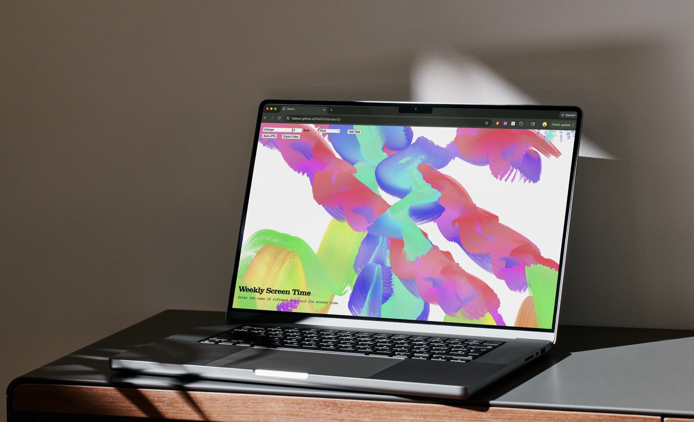
키네틱 타이포그래피 화면
typography web on screen
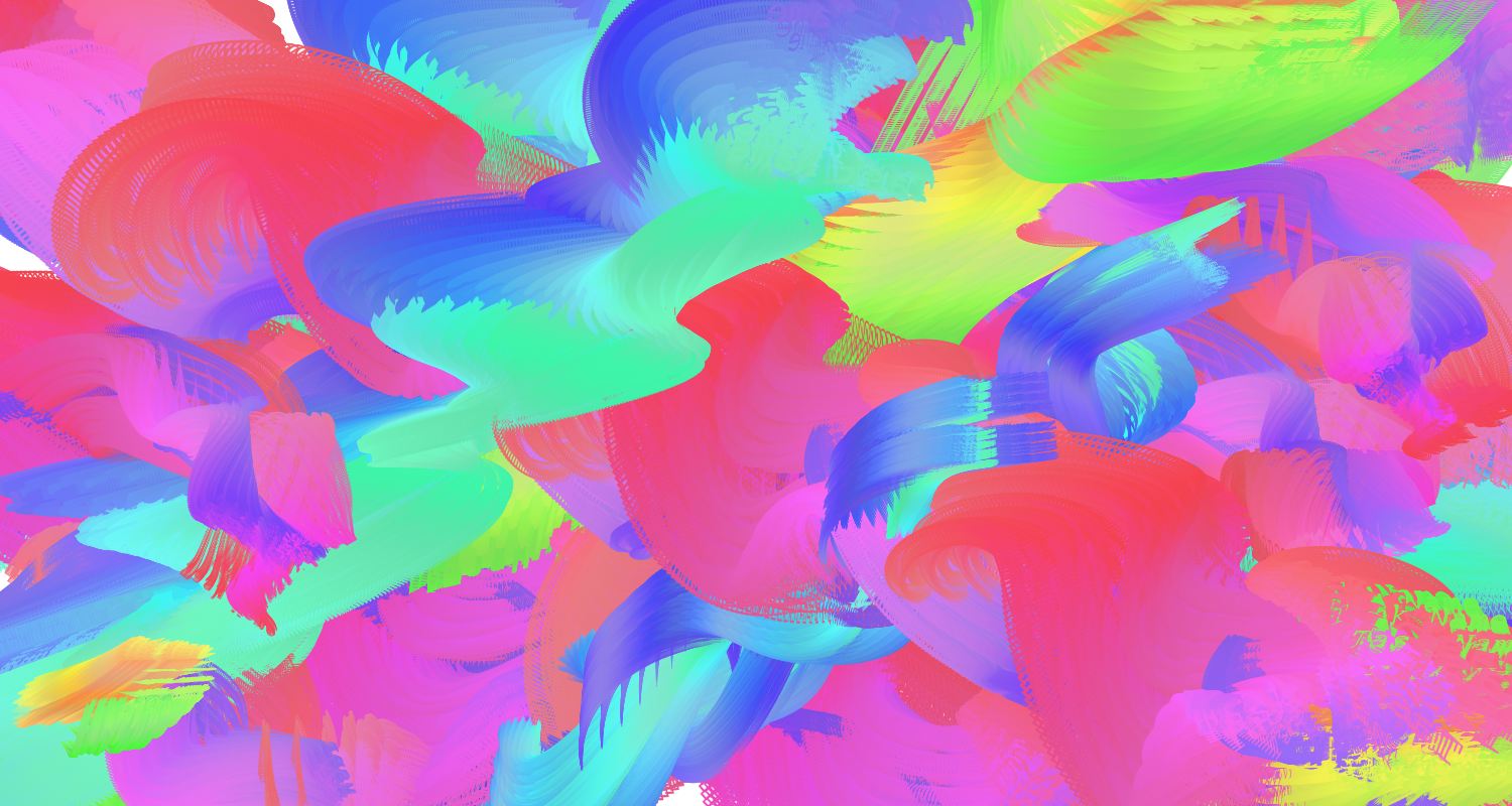
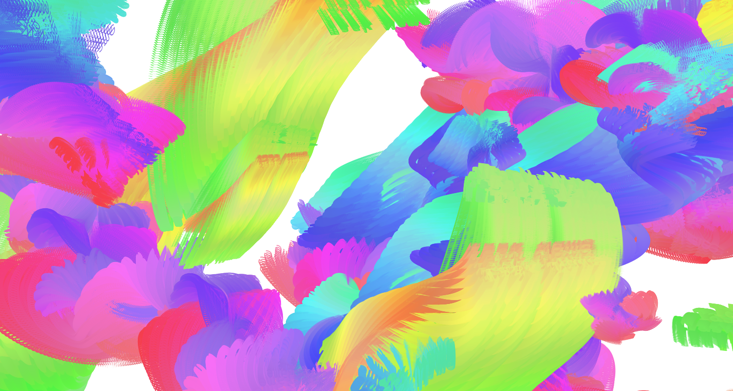
타이포그래피의 예시
Examples of image generation
Process
각 카테고리는 서로 다른 색상과 움직임을 통해 표현하였습니다. ‘업무’는 파란색으로 표현되며, 보다 구조적이고 목표 지향적인 움직임으로 차분하게 위로 상승하는 흐름을 보입니다. 반면 ‘오락’은 분홍색으로, 보다 자유롭고 예측 불가능하게 움직이며 웹 서핑의 감각을 시각화합니다. ‘소셜’은 노란색으로 표현되며, 리본처럼 이어지는 연속적인 흐름을 통해 사람 간의 연결과 상호작용을 상징합니다.
홍보물의 디자인 시스템에서는 화면 속 여러 창의 탭을 연상시키는 검은색 블록을 활용하였습니다. 키네틱 타이포그래피를 제외한 요소에는 흑백 팔레트를 적용하여, 시각화 속 색상의 대비와 강조를 극대화하였습니다.
Each category is expressed through a distinct color and movement. “Work,” rendered in blue, follows a more structured and goal-oriented motion, calmly swirling upward. In contrast, “Entertainment,” in pink, moves freely and unpredictably, evoking the concept of web surfing. “Social,” in yellow, flows in a continuous, ribbon-like motion, symbolizing connection and interaction between people.
On the design system of promotional materials, blocked typography resembling multiple tabs or on-screen alerts was used. A black-and-white palette was applied to all non-kinetic elements to emphasize the color within the visualization.
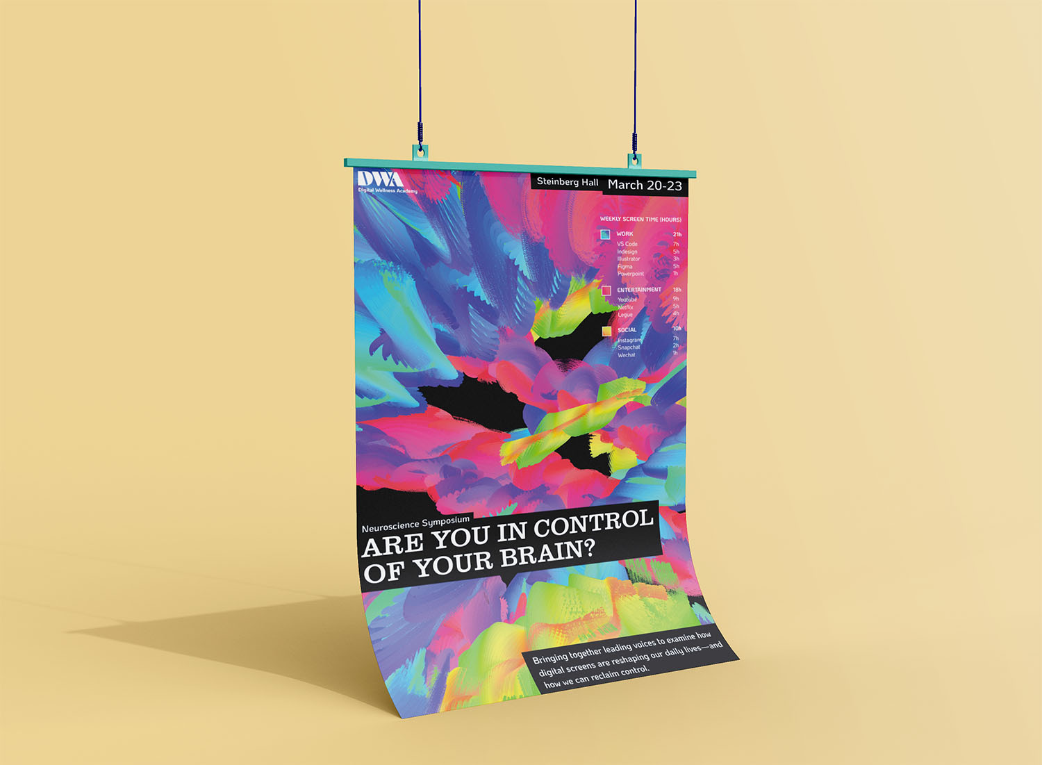
포스터 디자인
poster design
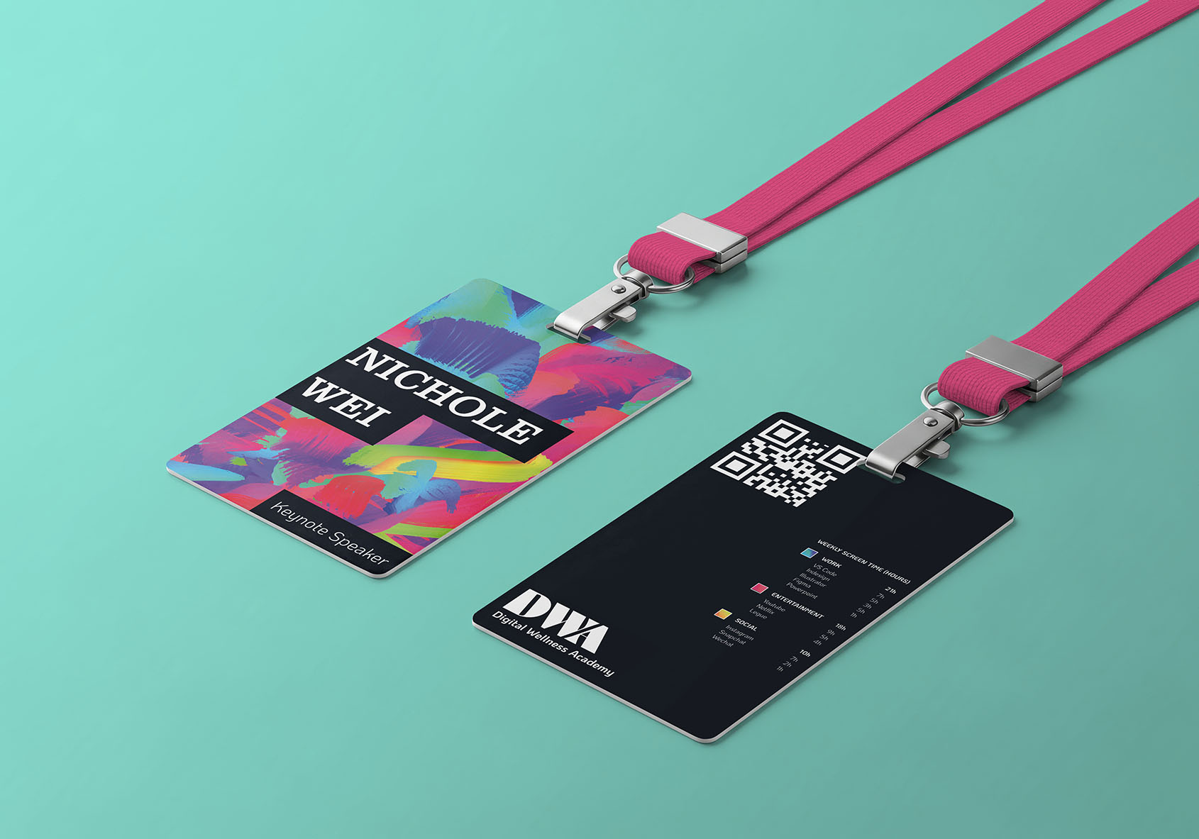
이름표 디자인
name tag
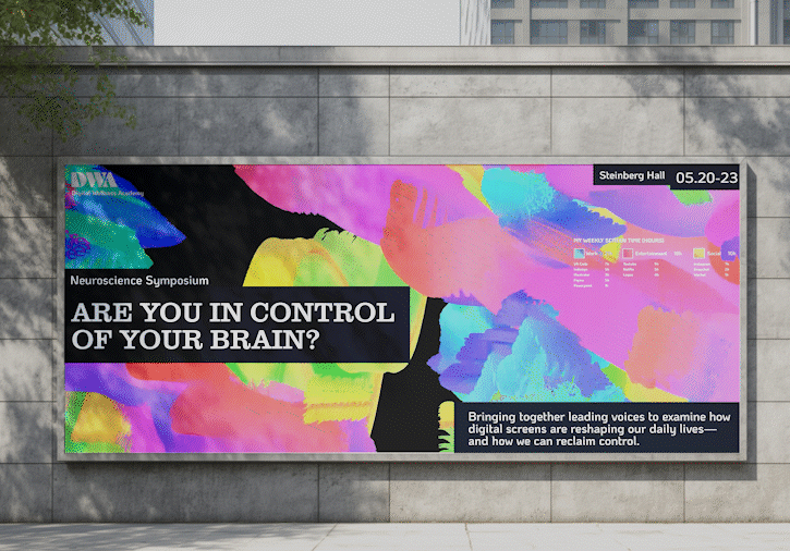
빌보드 광고 화면
billboard screen